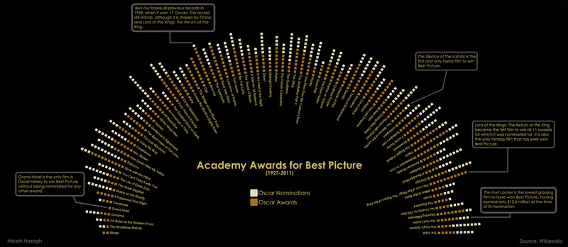
Academy Awards for Best Picture

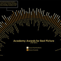
After having done several visualizations using my own data, I thought it was time to branch out to a public data set. I made some changes to an algorithm I used to visualize awards won by movies I own and applied it to films that have won the Oscar for best picture. The result showed interesting moments in Oscar history, some of which I make note of in the graphic.

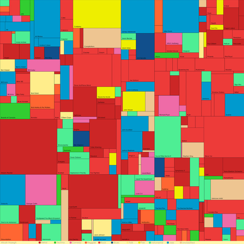
Music Collection Treemap

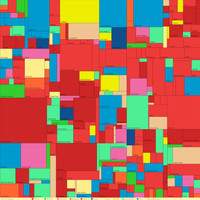
After visualizing my movie collection, I thought it would be neat to do something similar for my music collection. I chose to create a treemap of my music files where each shape represents a band. The size of a shape reflects how much music I have from that band, and the color is the band's musical genre. I was able to fetch the genre for each artist using the Freebase API and a little Python magic.

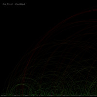
The Raven - Visualized

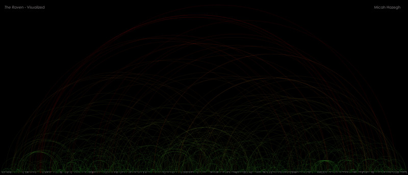
Inspired by Martin Wattenberg's The Shape of Song, I decided to create a similar visualization but using text as input rather than music. I used Edgar Allen Poe's The Raven for my first attempt. Each arc is a connection between one occurrence of a word and the next occurrence of that same word. The color of an arc is determined by the distance between the two occurrences, with colors ranging from green to red.

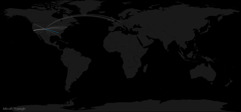
A Week on the Internet

This is a map of my browser history over the course of one week. Each line represents a connection from my location (Denver,CO) to the latitude- longitude point a given website was traced to. The colors of the lines range from gray to white to blue, with blue representing the highest number of visits.

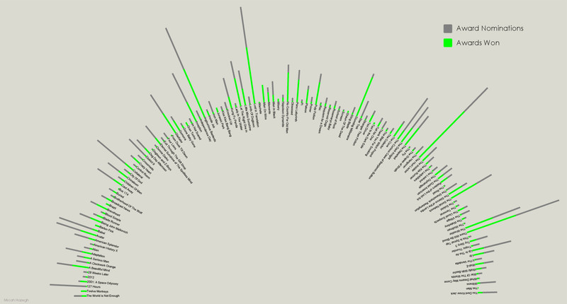
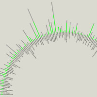
Movie Awards Visualization

A different interpretation of my movie collection, this time showing award data for each movie. The grey bars along the perimeter of half-circle represent the number of nominations each movie has received, and the green bars represent how many awards each movie has won. Award data for each movie was fetched using the Freebase API.

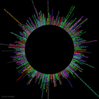
Movie Rating Visualization

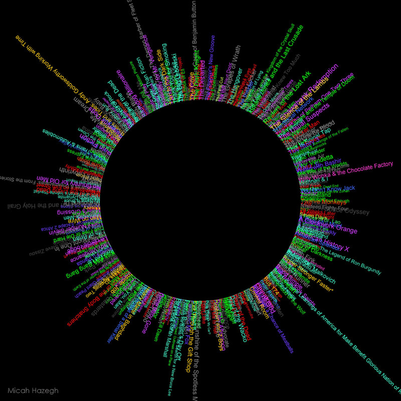
A circular visualization of my movie collection. Ratings and genres of each movie were fetched using an IMDB API and a quick Python script. From there I wrote a Java program to parse the data and arrange the movie titles in a circle. The size of the titles is determined by their IMDB rating (larger text means better rating), and the color of each title depends on their genre.

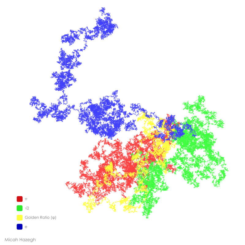
Paths of Irrational Numbers

For this visualization I used the first 1,000,000 digits of π, e, √2, and the Golden Ratio to create four numerically determined paths. A Java program scans over each digit of the irrational numbers. If the number is odd the path will make a left turn, if it's even a right turn will be made. All four paths are colored differently and then overlaid onto each other.

Micah Hazegh | mhazegh@gmail.com